Surroundings significantly impact how well we function during long working hours. Drab white walls often drain energy without us even noticing the underlying cause. Color psychology plays a massive role in stimulating the brain for complex tasks or creative problem solving.
Certain hues specifically trigger alertness while others encourage deep relaxation to manage stress. Selecting the right palette transforms a boring spare room into a powerhouse of daily efficiency. Nineteen distinct options await you here to suit various personal design preferences.
Boosting your output might be as simple as grabbing a paint brush. Focus becomes much easier when the visual environment supports your mental state. Creativity flourishes where the eyes feel comfortable and truly inspired. Changing your backdrop is the smartest investment for your career.
Boost Focus With Strategic Color Choices
Your physical environment dictates your mental energy more than you might realize, as staring at sterile white walls can slowly sap your motivation. Strategic pops of color actually stimulate neural pathways for better problem-solving while making long hours feel less exhausting.
By intentionally selecting a palette that resonates with your work style, you turn a dull room into a space that actively supports your career goals.
- Sterile white backgrounds often deplete mental energy levels unnoticed.
- Specific hues can trigger necessary alertness or induce relaxation to lower stress.
- A visually inspiring environment allows creativity to flourish naturally.
- Updating your workspace backdrop is a practical investment in your daily efficiency.
Color Your Productivity
-
The “White” Problem
Sterile white backgrounds often deplete mental energy levels unnoticed.
-
Mood Colors
Specific hues can trigger alertness (yellow/orange) or induce relaxation (green/blue).
-
Spark Ideas
A visually inspiring environment allows creativity to flourish naturally.
-
Smart Investment
Updating your backdrop is a practical investment in your daily efficiency.
1. Electric Color Blocking
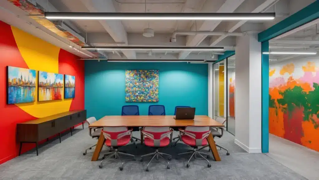
Audacity defines this workspace where vibrant red clashes beautifully with cool teal. Energy levels naturally rise when surrounded by such stimulating and powerful tones. Boredom cannot exist in a space designed to provoke active thought.
Stimulating environments encourage rapid brainstorming and dynamic problem solving during work hours. Balance is achieved by pairing the fiery wall with cooling blue sections. Artists and innovators often utilize this strategy to keep ideas flowing.
2. Weathered Coastal Planks
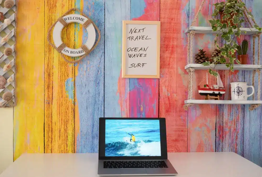
Rustic textures on the wall evoke immediate feelings of seaside relaxation. Yellow and blue stripes create a playful yet calming backdrop for working. Nautical elements transform a simple desk into a creative tropical escape.
Wanderlust often fuels the best creative writing sessions for travel bloggers. Bright pastel tones keep the mood light during intense deadline pressures. A white desk provides a clean surface that grounds the busy wall.
3. Abstract Nebula Texture
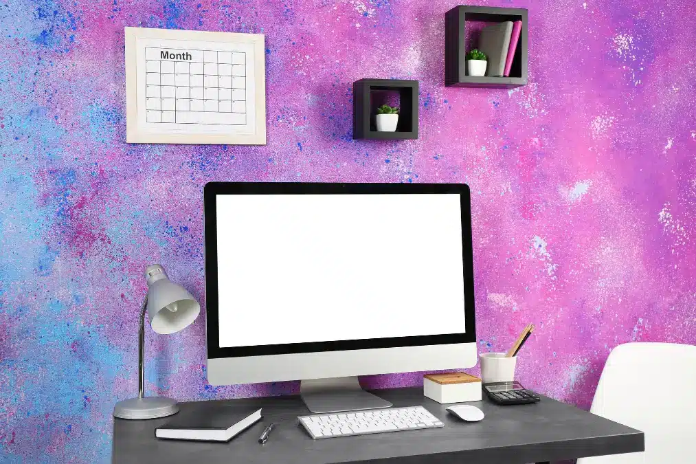
Spontaneity bursts forth from this dramatic, mixed magenta and blue surface treatment. The complex textured effect offers an engaging backdrop that captures visual attention instantly. Creative professionals frequently choose such expressive looks to mirror their vibrant internal ideas.
Intensity of the deep purple hues fosters an atmosphere of high concentration for challenging tasks. Minimalist furnishings provide necessary contrast to ground the walls’ frantic appearance. Simple accessories, like the black cube shelves, balance the overwhelming visual weight successfully.
4. Earthy Terracotta Focus
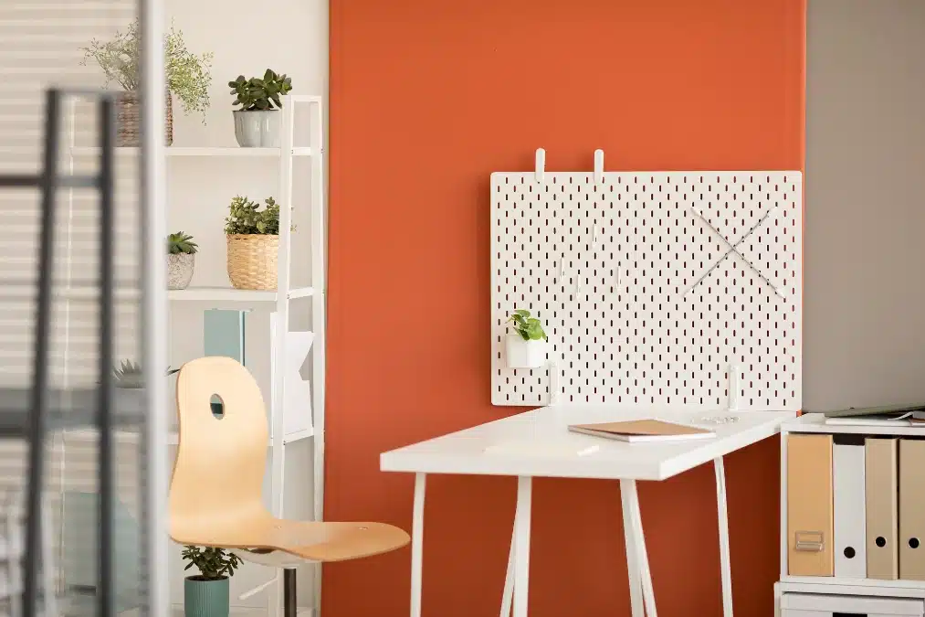
Enthusiasm flows from this rich, deep terracotta shade used as a powerful accent wall. The earthy undertones deliver essential warmth, making the workspace feel genuinely inviting. Paired with white furniture and crisp shelving, the color provides sophisticated energy.
Psychology associates burnt orange with boosted productivity and engaging social communication. Incorporating natural greenery helps mitigate any intensity and keeps the mind centered. The contrasting neutral gray wall ensures the overall design maintains a calming visual balance.
5. Restorative Sage Green
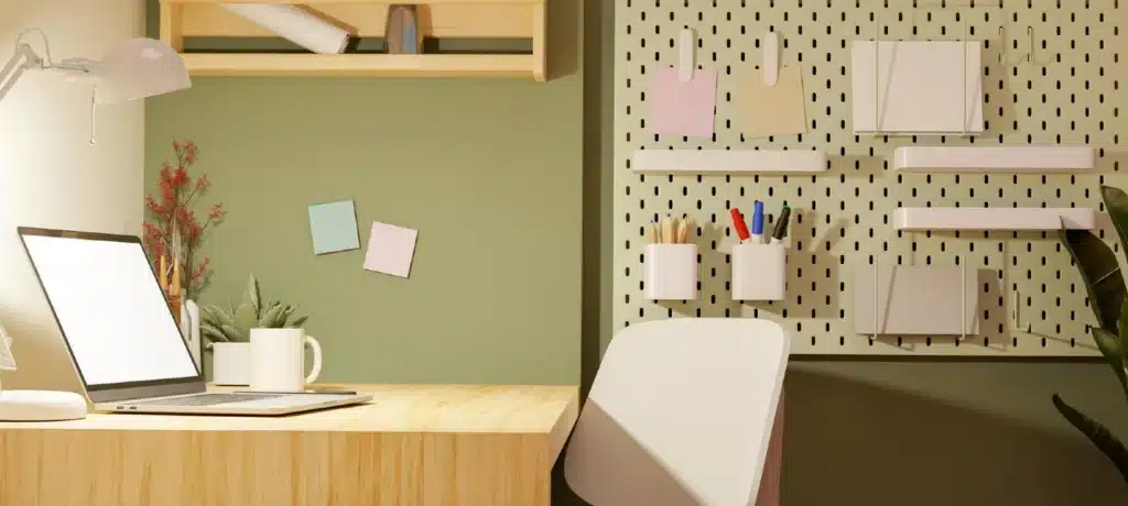
Serenity defines this workspace where muted sage green dominates the walls gracefully. Science confirms that this natural hue reduces eye fatigue during extended screen sessions. Biophilic principles utilize the combination of green and wood tones to enhance relaxation immediately.
Balance is brought to the fore through the pairing of the earthy paint and light wooden desk. The subtle, enduring quality of sage green makes it a timeless choice for any professional setting. Adding living plants further promotes mental clarity and reduces the psychological effects of stress.
6. Dynamic Two Tone Split
Duality characterizes this bold workspace featuring a sharp diagonal division. Optimism flows from the sunny side while the violet hue sparks artistic imagination. Visual energy remains high due to the striking contrast between these opposing hues.
Symmetry is achieved by coordinating furniture colors with the wall paint choice. Innovators benefit from an environment that physically represents out of the box thinking. White lines serve as a clean boundary to keep the design looking intentional.
7. Clean Canvas White
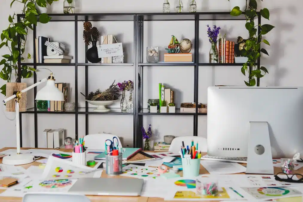
Simplicity offers the best foundation for a truly busy and active working style. The crisp white walls provide immediate visual relief from the highly cluttered desktop below. Utilizing a neutral background color keeps the emphasis solely on the creative projects and tools.
Clarity remains paramount even when the creative process requires a bit of disarray. Biophilic elements, such as the numerous trailing plants, help maintain focus despite the visual noise. Bold black shelving structures the entire scene, anchoring the disparate items successfully.
8. Deep Concentration Charcoal
Depth defines this serious workspace where rich charcoal gray envelops the background walls. Dark hues naturally minimize distraction, which aids greatly in periods of high level concentration. Sophistication elevates the room’s look, ensuring the multifunctional space feels intentionally designed.
Warm lighting and white shelving prevent the dark shade from feeling overly enclosing. Psychology suggests that these tones support decisive thinking and a strong sense of purpose. Integrating ambient light sources is essential to maintain visual comfort throughout the entire workday.
9. Invigorating Sky Blue
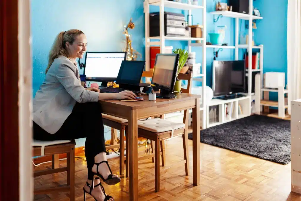
Refreshment streams from this energetic, saturated sky blue surrounding the workspace. The hue encourages clear communication, making it an excellent backdrop for frequent video meetings. Psychology connects this specific shade of blue with improved concentration and intellectual clarity.
Warm wooden tones and flooring provide a necessary, organic anchor point for the highly saturated color. Utilizing white open shelving prevents the intense blue from overpowering the entire space visually. This lively shade banishes any sense of monotony often found in dull, traditional offices.
10. Saturated Goldenrod Boost
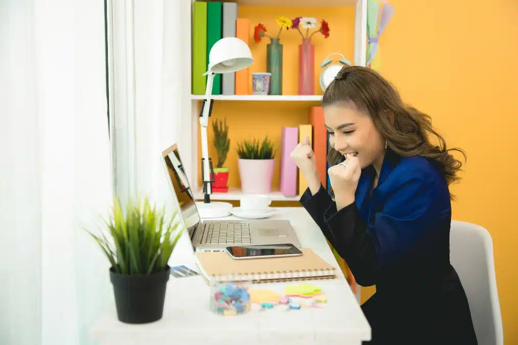
Optimism radiates from this highly saturated goldenrod color chosen for the backdrop. The hue acts as a strong visual stimulant, making it useful for combating afternoon lethargy quickly. Psychology connects yellow with joy, creativity, and elevated feelings of happiness.
Restraint is crucial when applying such an intense shade across large surfaces for prolonged viewing. White accessories and copious natural light help diffuse the energetic intensity successfully. The joyful atmosphere created makes this an excellent environment for celebrating small wins and maintaining momentum.
11. Executive Energy Accent
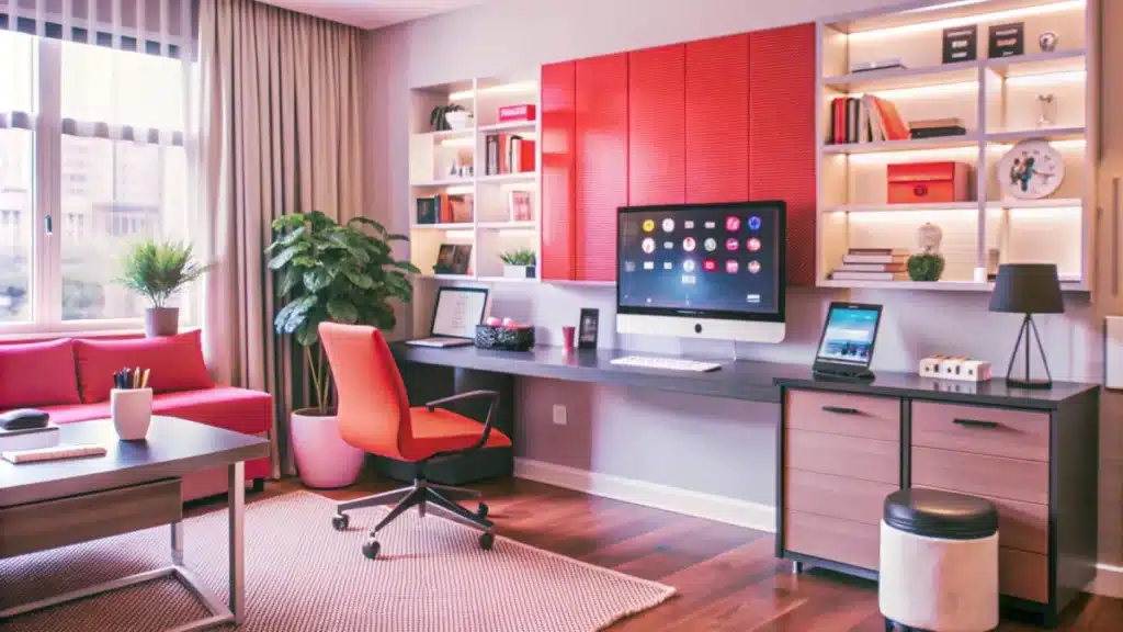
Stability underlies this design where soft, neutral taupe provides a foundation for serious thought. A strategic pop of coral red introduces bursts of invigorating energy without causing distraction. Utilizing subtle contrast ensures the space feels highly professional and effortlessly modern.
Illumination from the built-in shelves naturally draws the eye toward the main work surface. The warm accent color stimulates urgency, which is beneficial for tackling important, pressing tasks. Maintaining a muted primary wall color encourages extended periods of deep concentration easily.
12. Deep Contrast Creativity
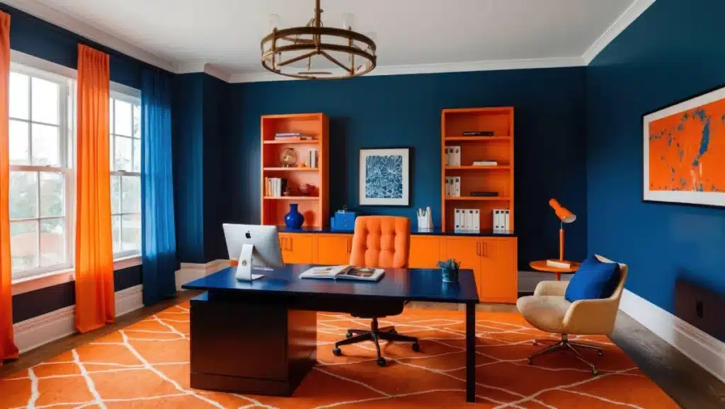
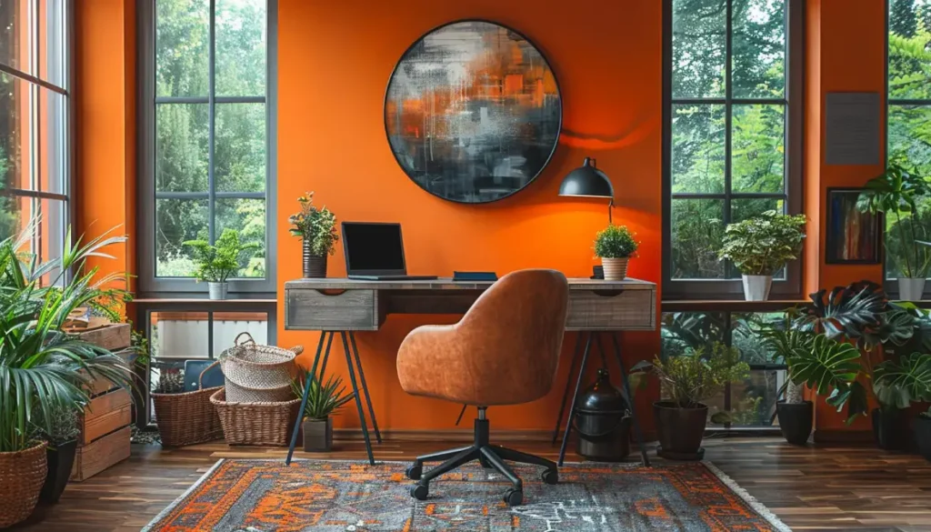
Gravitas permeates this workspace through the application of a rich, commanding navy blue. The deep shade encourages introspection and long hours of focused, analytical thought easily. Saturated orange accents provide the crucial bursts of stimulating energy needed for creative tasks.
Juxtaposition of the cool blue walls and warm orange furniture creates an intentional, electric tension. The dynamic color pairing supports both high level intellectualism and spontaneous excitement effectively. Large, patterned rugs and accessories ensure the bold palette feels cohesive rather than overwhelming.
13. Minimalist Detail Focus
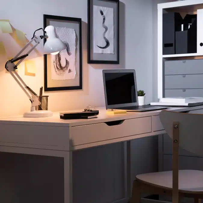
Calmness pervades this monochromatic setting, allowing for the highest level of concentration. The barely discernible pale gray acts as a neutral canvas for all intellectual, detail oriented tasks. Utilizing simple black and white decor further reduces visual clutter and external distractions.
Ambience created by the warm desk lamp defines the small, highly focused working zone. The lighting contrasts sharply with the subtle walls, keeping the user’s eyes on the immediate task. Writers and readers benefit significantly from this non stimulating environment designed for long, quiet sessions.
14. Creative Earth Tones
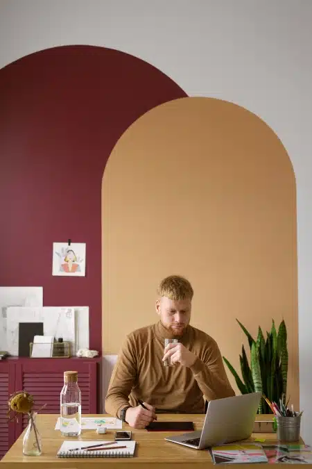
Richness elevates this workspace through the application of deep, earthy color blocking. The sophisticated combination of burgundy and camel creates a cozy yet professional atmosphere easily. Artistic arch shapes add a visual design element, stimulating creative inspiration naturally.
Seriousness associated with the deep maroon helps anchor the mind during focused tasks. The warm tan block balances the intensity, ensuring the mood remains inviting and grounded. Combining these saturated hues requires plenty of clean white space to prevent visual heaviness successfully.
15. Scholarly Cocoa Brown
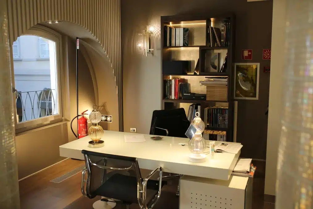
Gravitas underscores the atmosphere of this formal home office space painted in deep cocoa brown. The warm, rich color inherently promotes feelings of stability and academic seriousness throughout the room. Traditionally, deep browns foster long periods of focused thought and quiet, deliberate study.
Contrast is achieved by pairing the dark walls with a bright, high gloss white desk surface. Warm ambient lighting plays an essential role in softening the intensity and making the space feel luxurious. Professional writers and executives often select this color for its enduring, grounded sense of authority.
16. Imagination Lilac and Gray
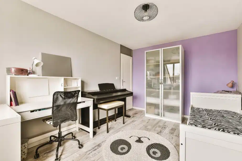
Imagination flows freely within this charming space highlighted by a soft, calming lilac accent wall. Psychology ties this soothing purple shade to enhanced wisdom and balanced, creative thinking easily. The adjacent light gray walls ensure the overall scheme remains grounded and visually stable.
Versatility makes this color pairing excellent for multi functional rooms requiring various energy levels. White and black furniture provides stark contrast, keeping the area feeling crisp and thoughtfully designed. The lightness of the colors ensures the smaller space feels expansive rather than overly contained.
17. Essential Clarity White
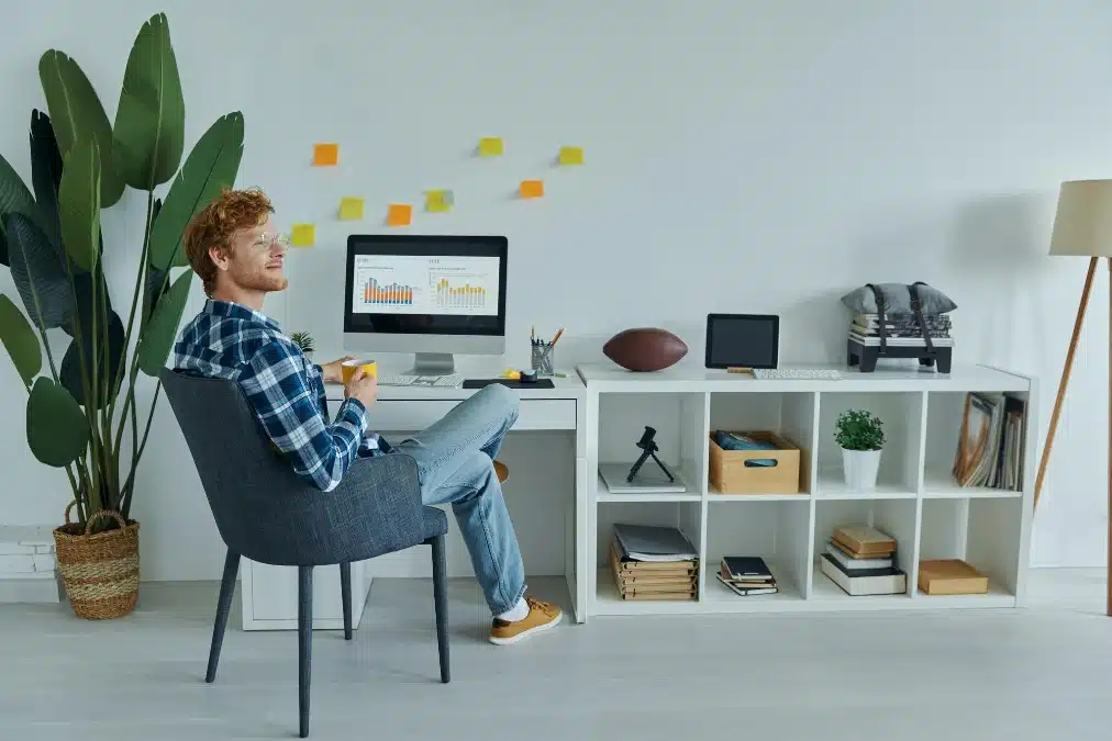
Neutrality provides the clearest mental space required for rigorous analytical work. The absence of wall color allows the eye to completely rest, reducing fatigue during long sessions. White serves as a non distracting background, letting the focus remain entirely on the monitor screen.
Biophilic elements, such as the large tropical plant, introduce necessary life and vitality to the clean design. Controlled bursts of color from the sticky notes provide momentary creative visual stimulation. Utilizing bright accessories allows the user to change the color palette easily without repainting walls.
17. Stoic Deep Moss

Determination fills the room when surrounded by this solid, dark earthy shade. Distractions fade away quickly against the matte finish that absorbs excess light. Simple furniture pieces stand out clearly to create a structured, organized look.
Efficiency increases significantly when the environment mimics a quiet, secluded library space. Writers find this specific color helpful for maintaining long hours of focus. Soft beige clothing and wood accents prevent the dark wall from feeling cold.
18. Architectural Warm Taupe
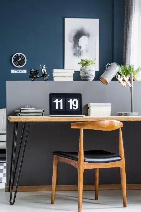
Refinement characterizes this upscale workspace featuring warm mocha walls. Brown tones provide a sense of stability and reliability during work. Arch details add architectural interest to the solid background color.
Illumination from the shelves highlights the rich texture of the paint. A glossy white desk creates necessary contrast against darker surroundings. High level executives often prefer this palette for its grounding effect.
19. Executive Charcoal Contrast
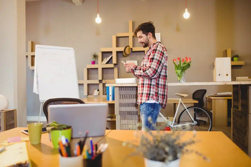
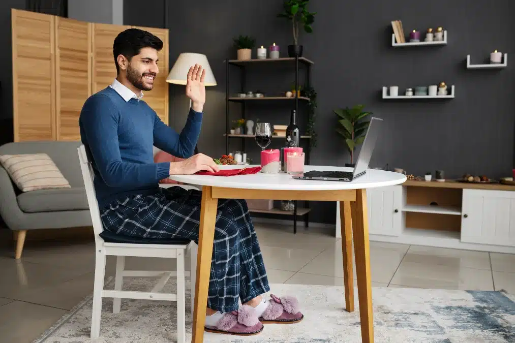
Gravity defines this deep charcoal backdrop that adds instant executive presence on video calls. Darker shades successfully hide the clutter of daily life while maintaining a sharp focus. Contrast between the moody paint and the white table creates a striking visual impact.
Composure remains high when your surroundings feel grounded and aesthetically pleasing. Remote workers often utilize such strong neutral tones to appear polished from the waist up. Soft lighting warms the black hue to prevent the home office from feeling too cave like.

No Comments